Whiteboard explainer videos cutting instructions
Mindset
Create the BEST possible video you can!
Why
We reduce the bounce rate and increase the perceived value of the video, so the viewer stays with it longer. This increases our chances of going viral and earning more money. The benefit for our viewers is maximized.
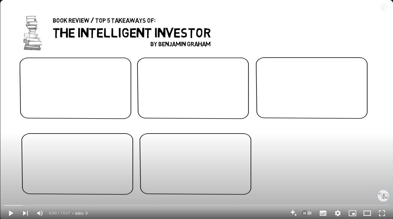
I. Show an overview
The best videos from our competitors provide an overview at the beginning and end. I would like to implement this as well.
In this video you can see a wonderful overview at the beginning and at the end. The viewer therefore has a brain-friendly division in front of their eyes.
So it’s important to get an impression of the script and what division makes sense at the beginning, before you start with the animation.
Actions
Video editor: Implement the overview at the beginning (without showing the details) and at the very end of a video (last seconds) before offering the 2 new video alternatives for watching next.
Here’s an optimized version of the instruction:
Video Editor:
1) Include a brief overview at the beginning of the video (without revealing details)
2) and again in the final seconds (with all details), just before presenting the two suggested videos for the viewer to watch next.
Ressources
Examples
The overview at the beginning and end is very well executed. To enhance the visual appeal, please ensure the content fields are large enough, so that all content fits neatly within the frame, avoiding any overlap with the edges.
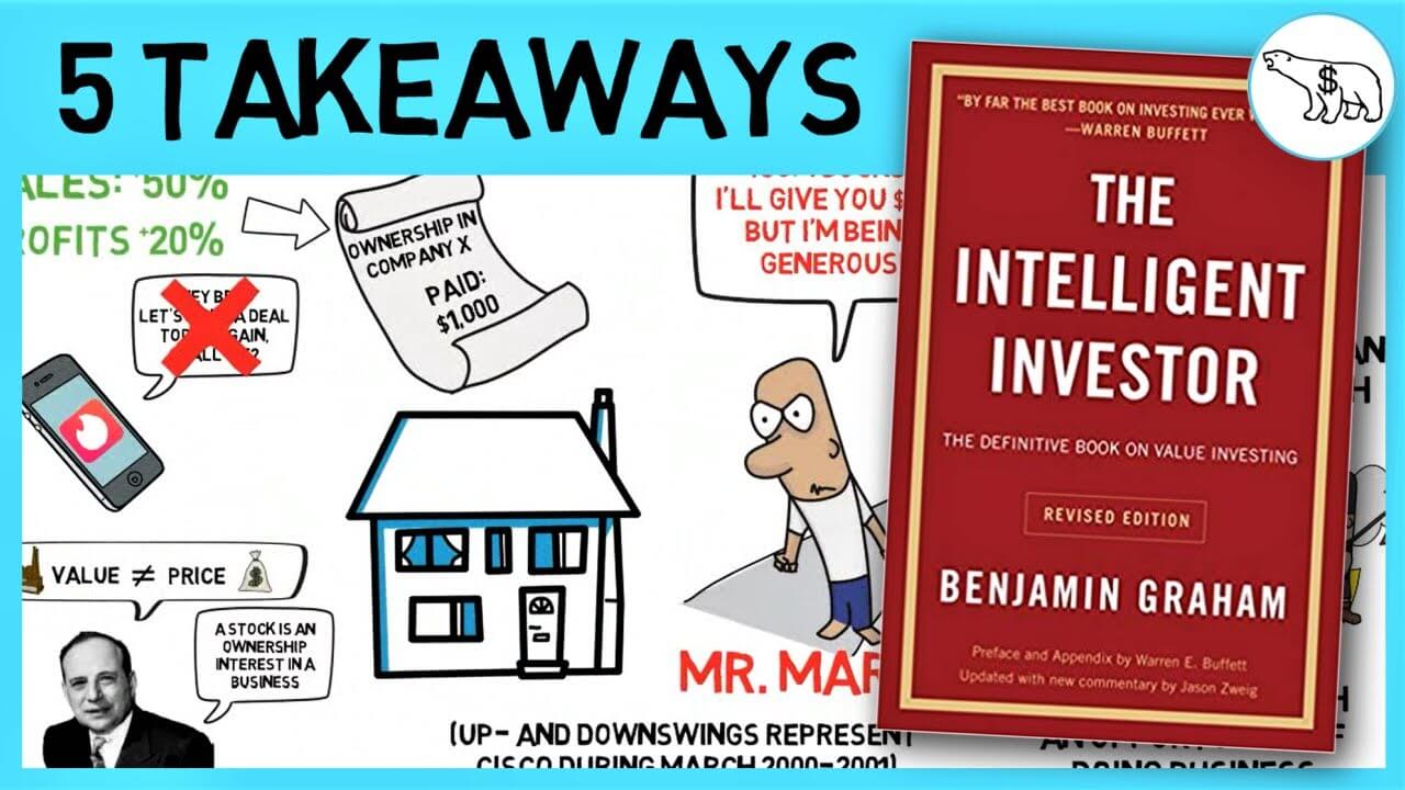
II. Connection between thumbnail and first video seconds
Actions
No direct actions (but future scripts we write will be more consistent with the thumbnail)
III. The intro should not exceed 20 seconds
Script and voice over need to be adjusted for future videos to meet the 20 seconds intro rule as good as possible.
Actions
No direct actions (but future scripts will be with optimized to fit this 20 seconds rule)
IV. The competition animates slower and more deliberately
This means, on average, fewer images are shown simultaneously. Doing this we avoid overwhelming the viewer.
However, there is always some movement in the frame, either through animation or zooming.
Avoid this
This scribe has too many faces. Viewer feels overstrained.

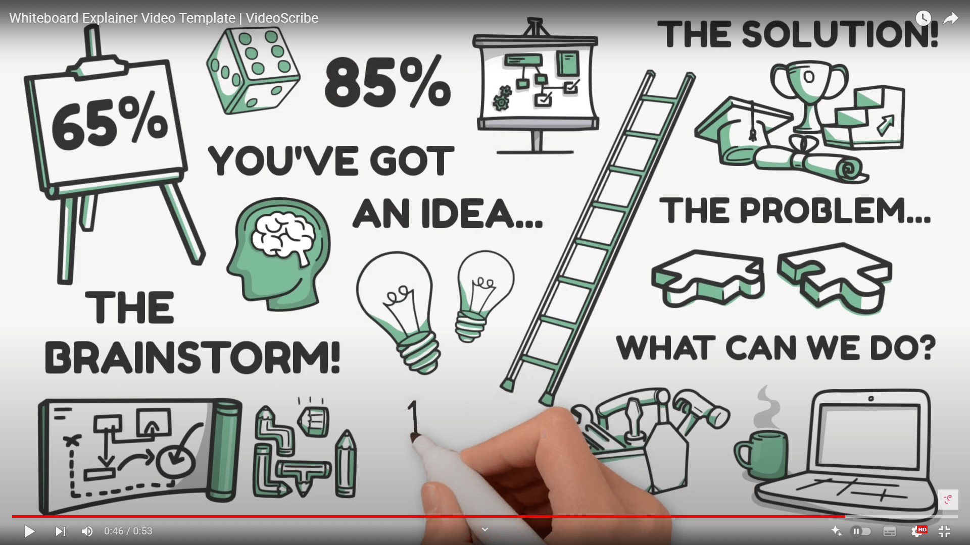
V. In good videos, the images are as stylistically as consistent as possible
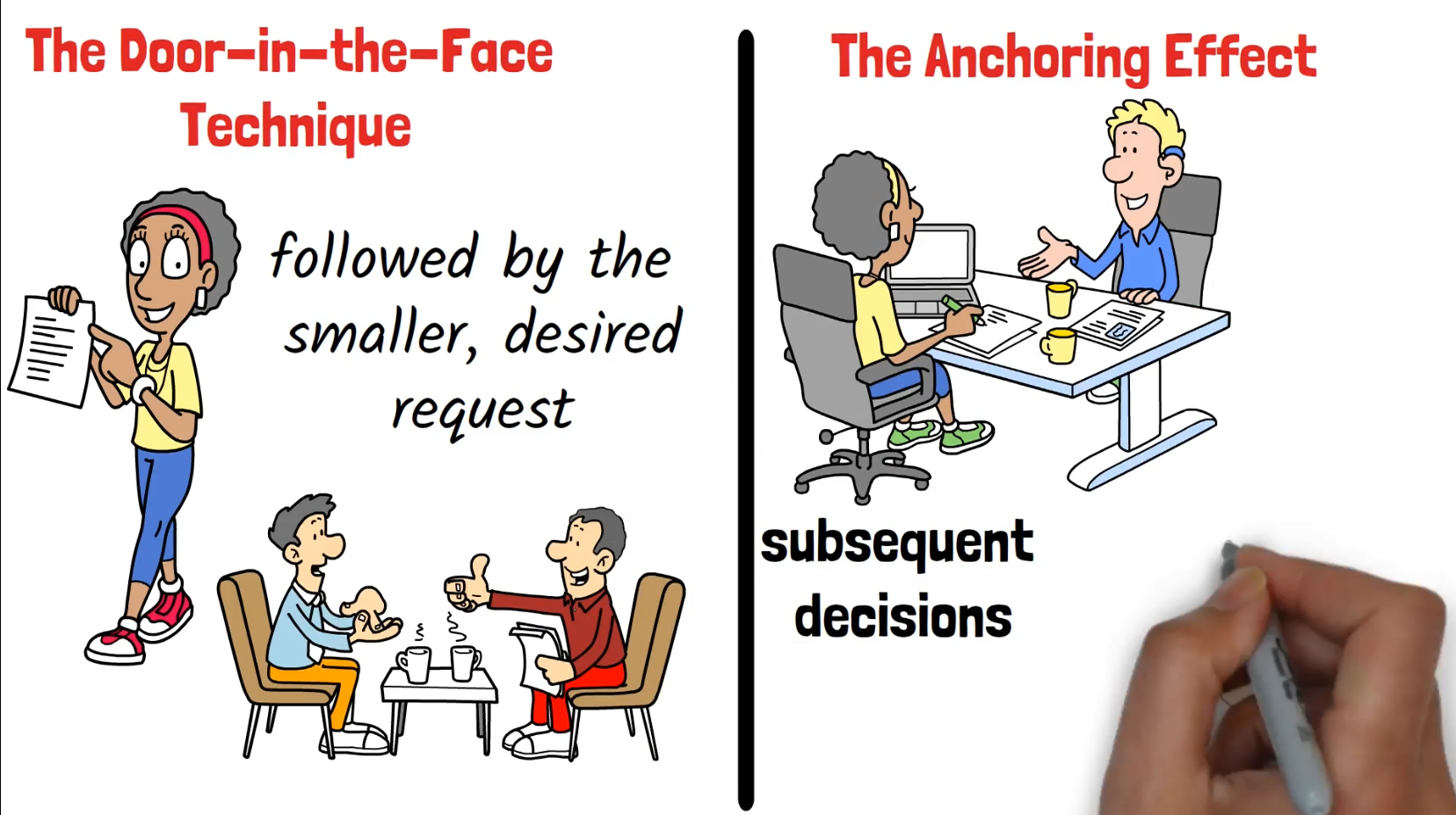
Select graphics that look as uniform as possible and have the same style.
Examples
In this example text and colors are quite consistent.
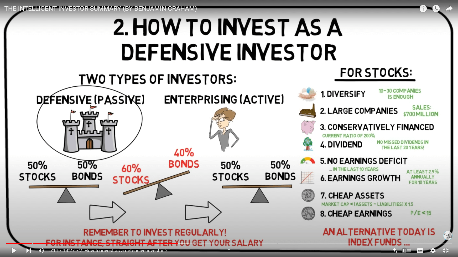
In this example every used image has a black / green styling.
In this example we see a clear structure, consistent images and (nearly) text style.
VI. Guidelines
1. First, show an overview and reference the thumbnail and title in (both the voiceover and) the visuals. Important: The voiceover has to start at 00:00.
2. Use mainly black and red text. Use text mainly as headline of the rectangles.
3. End screen: Zoom out and show the overview again (example).
Avoid this
This scribe has too much text. The text repeats. The word „Voiceover“ does not make any sense in this context (don’t copy obvious mistakes from the script ;)).

Avoid people without a face.
Avoid compressed logos / images (in this case The Bitcoin Magazine logo looks compressed)

Export settings
Export the video in Full HD 1920 x 1080 pixels. The end user often has such a resolution and 1280 x 720 pixels can therefore be considered outdated.

